TLDR
- Cowork's Live Artifacts let marketing and sales teams build self-refreshing dashboards by chatting with Claude. No code. No data team.
- The skill moved to brief-clarity, not engineering.
If you can write a brief for a creative team, you can write a prompt for a dashboard.
- Get my marketing campaign dashboard prompt.
- Vibe subscribers get The Cowork Starter Kit: 10 ready-to-paste prompts, the dashboard-building skill, the connector setup walkthrough.
Last month, I was prepping for a Monday training session with a marketing team at a luxury brand.
Their question for me: "Toni, how can we build dashboards without bothering the data team every time? Can you build them for us?"
I opened Cowork. I typed eight sentences.
12 minutes later, they had a working campaign performance dashboard that pulls from their HubSpot and refreshes itself every time they open it.
I haven't written a line of code in years.
Since, I've spent the past weeks building Live Artifacts with marketing and sales teams for our AI adoption programmes.
These is my own take, beyond all the promises you read on social.
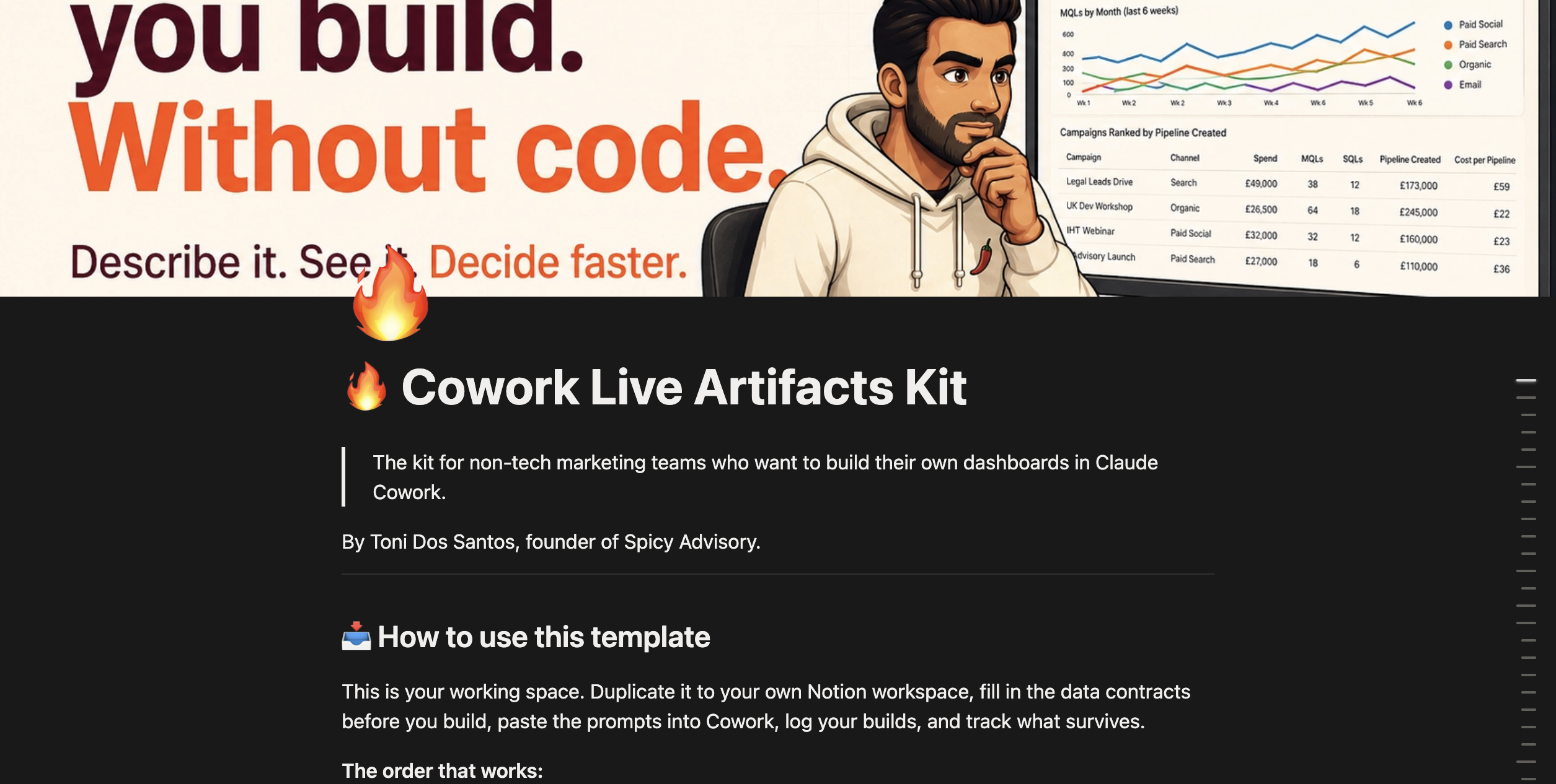
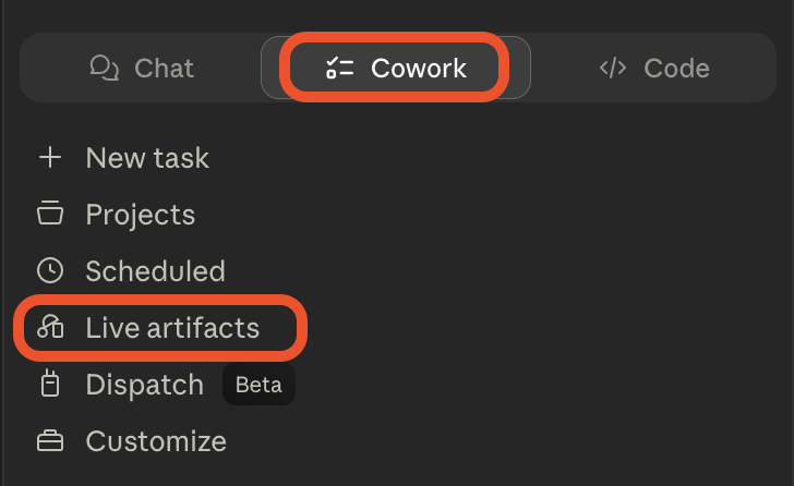
What Live Artifacts are
Quick context for anyone who hasn't opened Claude Cowork yet. Cowork is a feature for the desktop version of Claude. Mac or Windows. Paid plans only (Pro, Max, Team, Enterprise). It’s Claude Code for non tech teams. It can work directly on your files, take action, run agents, without any coding knowledge.
Live Artifacts are persistent HTML dashboards living in a dedicated tab inside Cowork.
Artifacts have been around for a long time in Claude. ai. They are basically HTML assets you can create with a prompt (webpage, dashboards, mini games, tools…). But they are static. You build them once and that’s it. If you want to update the data, you need to rebuild them.
Live Artifacts solve that limitation.
You build them by chatting with Claude. You describe the layout, the data sources, the design. Claude generates the page, wires it to your connectors (HubSpot, Salesforce, Google Sheets, Notion, your local files), and saves it. Every time you reopen the artifact, it re-queries the data and refreshes.
A few things that matter:
- You don't write code. You describe what you want in plain English.
- The dashboard lives forever, not just inside the chat that made it.
- Version history is built in. Broke it? Roll back.
- You iterate by chatting. "Add a chart for paid spend." "Change the colors." "Filter by region."
A few things that don't work yet:
- you can't share artifacts with teammates (sharing is on the roadmap).
- And they live in Claude Desktop, not the browser.
"But I'm not technical"
I know what you're thinking. "The data team has always built these for me. I wouldn't know what to ask for. "
I'm not a developer either. I'm not great with Excel. I am no Power BI wizard.
The skill here is being clear about what decision the dashboard supports, who needs to see what, and where the data lives. That's a marketing skill. Or a sales skill. Not an engineering skill.
If you can write a brief for a creative team, you can write a prompt for Claude Cowork.

The first live dashboard I'd build
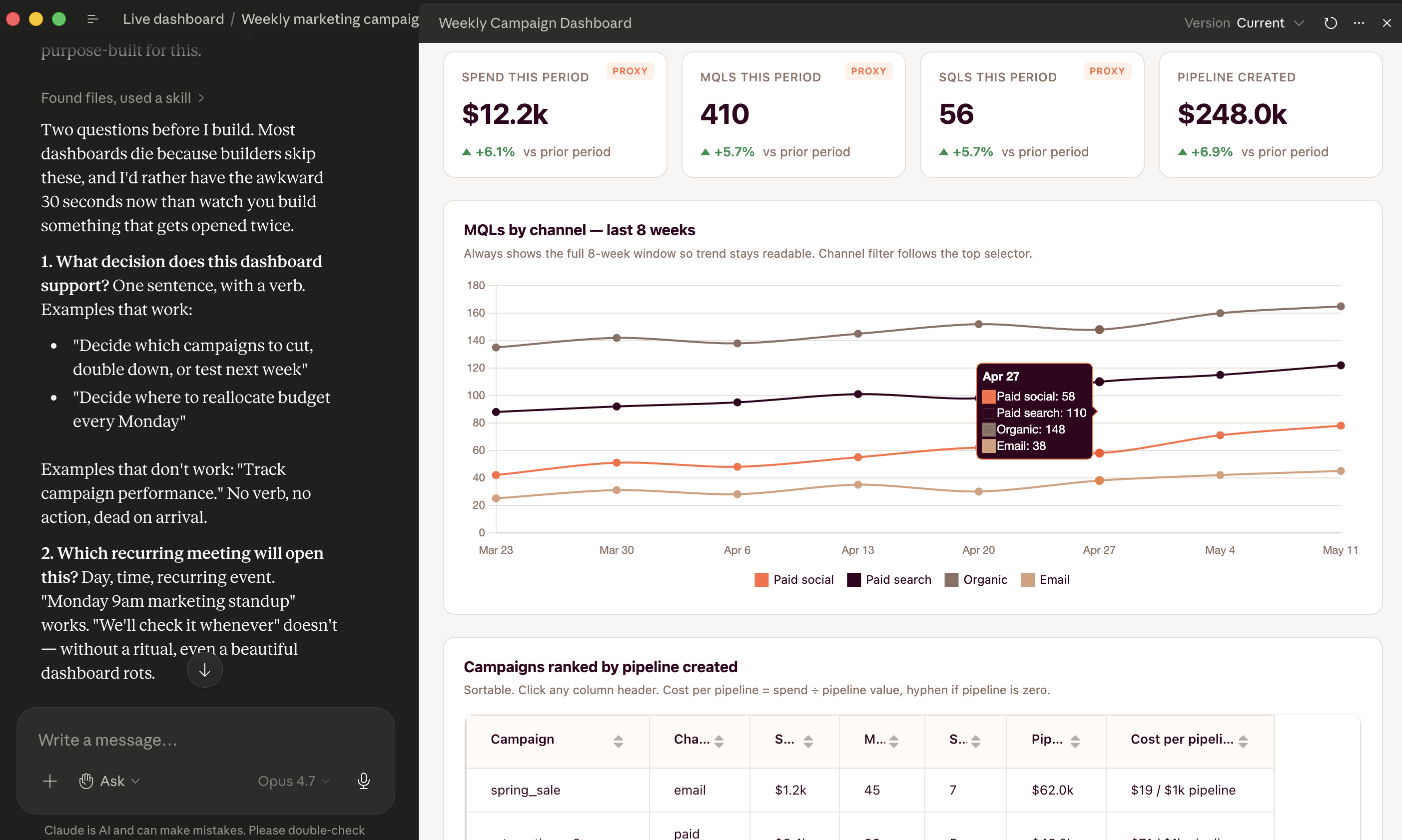
Here's the actual prompt I used for the marketing team last month. Paste it into Cowork, swap the specifics for your data, and you have a working campaign performance dashboard in minutes.
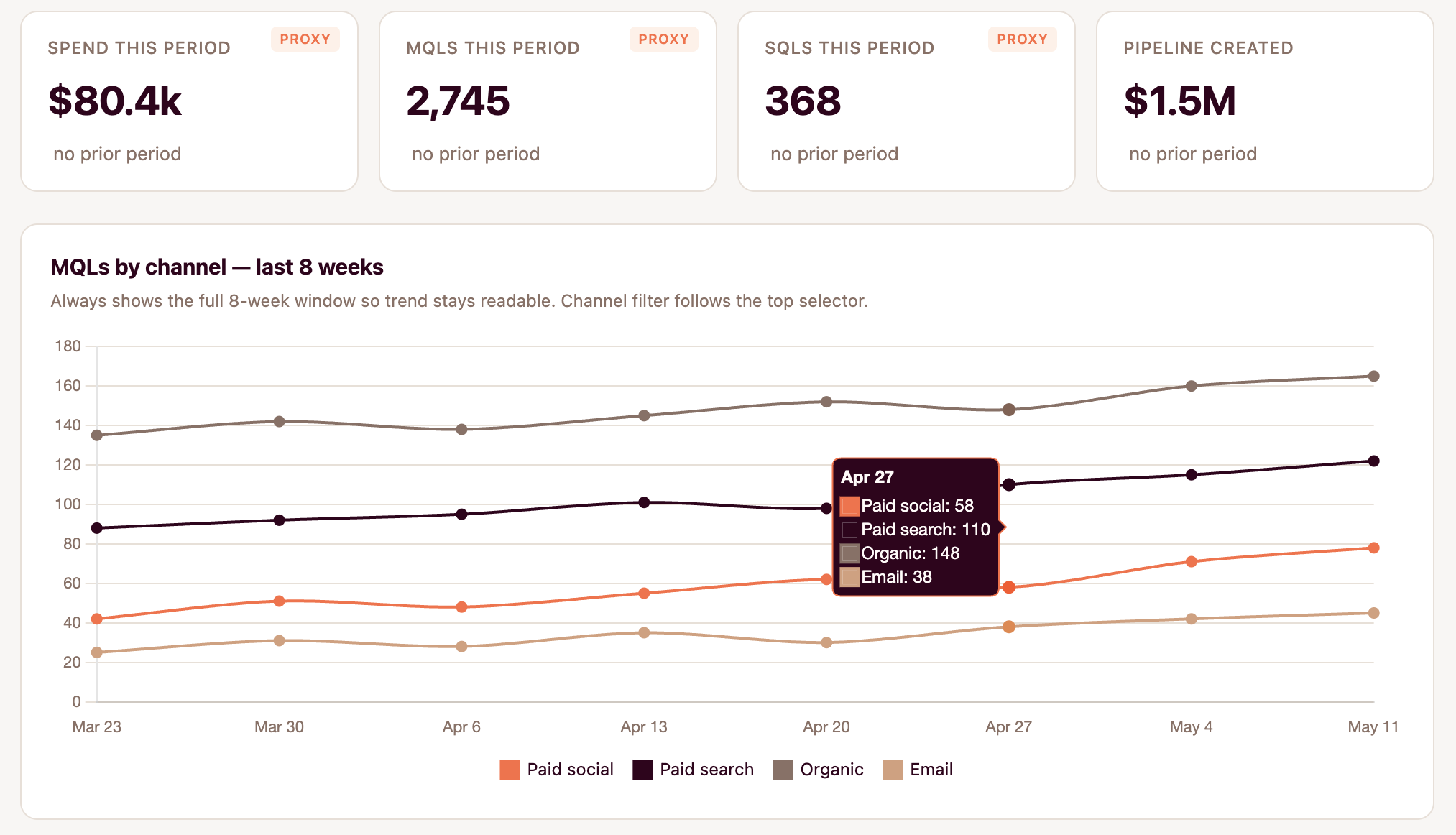
Build me a Live Artifact: a weekly marketing campaign performance dashboard. Data sources:
- HubSpot deals export
- Google Analytics weekly export (CSV in the cowork folder)
- Q4 targets spreadsheet (CSV in the Cowork folder) Layout:
- Top row: 4 KPI tiles · Total spend this week · MQLs this week · SQLs this week · Pipeline created this week Each tile shows the number + % change vs last week.
- Middle: trend line chart of MQLs by week, last 8 weeks, broken out by acquisition channel (paid social, paid search, organic, email).
- Bottom: table of campaigns ranked by pipeline created. Columns: campaign name, channel, spend, MQLs, SQLs, pipeline created, cost per pipeline. Sortable. Design:
- Filter at top: This week / Last 4 weeks / This quarter
- Brand color: [your primary]
- Sans-serif fonts, clean spacing
- KPI changes: green up arrow if positive, red down arrow if negative Refresh data every time I open it.
That's the whole thing. Eight bullets. Plain English. No code.
Claude will probably get 70-80% of it right on the first run. First time I tried this, the KPI tiles were stacked vertically instead of in a row, and the trend chart was using the wrong column.
Two follow-up messages fixed both.
"Put the KPI tiles in one horizontal row at the top." "For the trend chart, use the 'channel_name' column from the GA export, not 'source.'"
Three rounds of iteration. Twelve minutes total.
🔓 Get the full Cowork Starter Kit
The Dashboard-crafting skill + all 10 dashboard prompts (5 marketing + 5 sales) + connector setup walkthrough.
Join Vibe subscribers and get full access.
Subscribe now